Framing Modern Masters
Avant-garde art generally overtook prevailing frame styles often clashing with mass produced ornament and bright gilding. Some of the most harmonious results are achieved by imaginative use of old master frames whose classical proportions and stylized ornament possess a timeless quality, demonstrated by the first three paintings below.
All paintings framed by Paul Mitchell
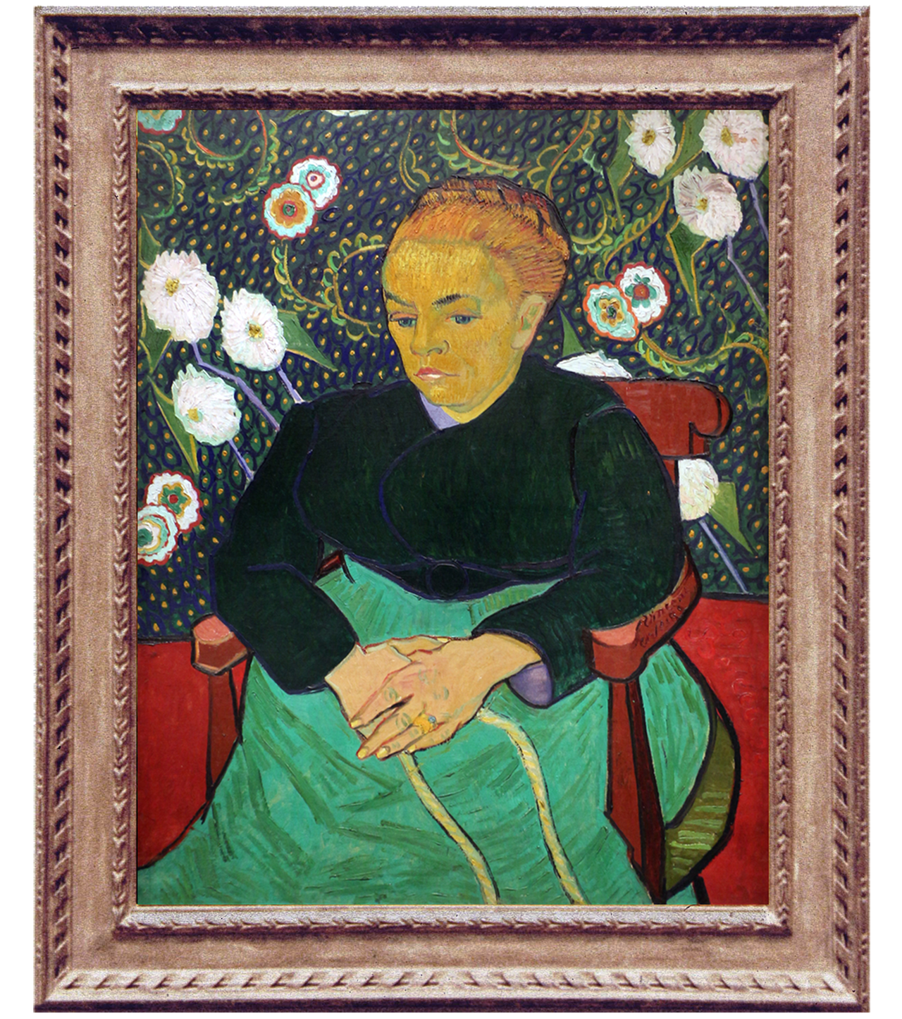
Before
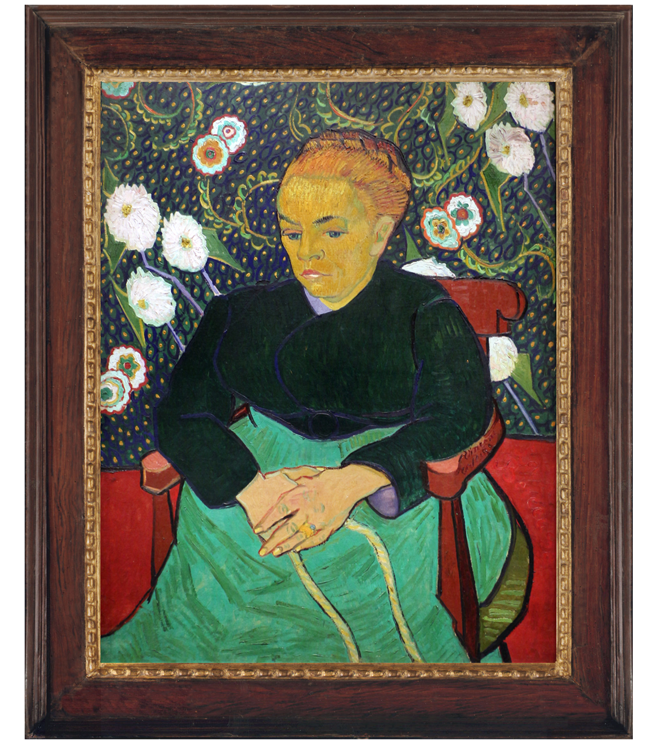
After
VINCENT VAN GOGH (1853-1890)
Madame Roulin Rocking the Cradle (La berceuse), 1889
The Art Institute of Chicago
The lack of harmony with Van Gogh’s ‘lullaby in colours’ is the first thing to strike the viewer in the inappropriate NeoClassical frame previously surrounding La berceuse. Its reframing in this rich border of polished walnut allows the painting to relax and expand, whilst the chain of fluidly gilded leaf-buds highlights and embraces this icon of maternal love.
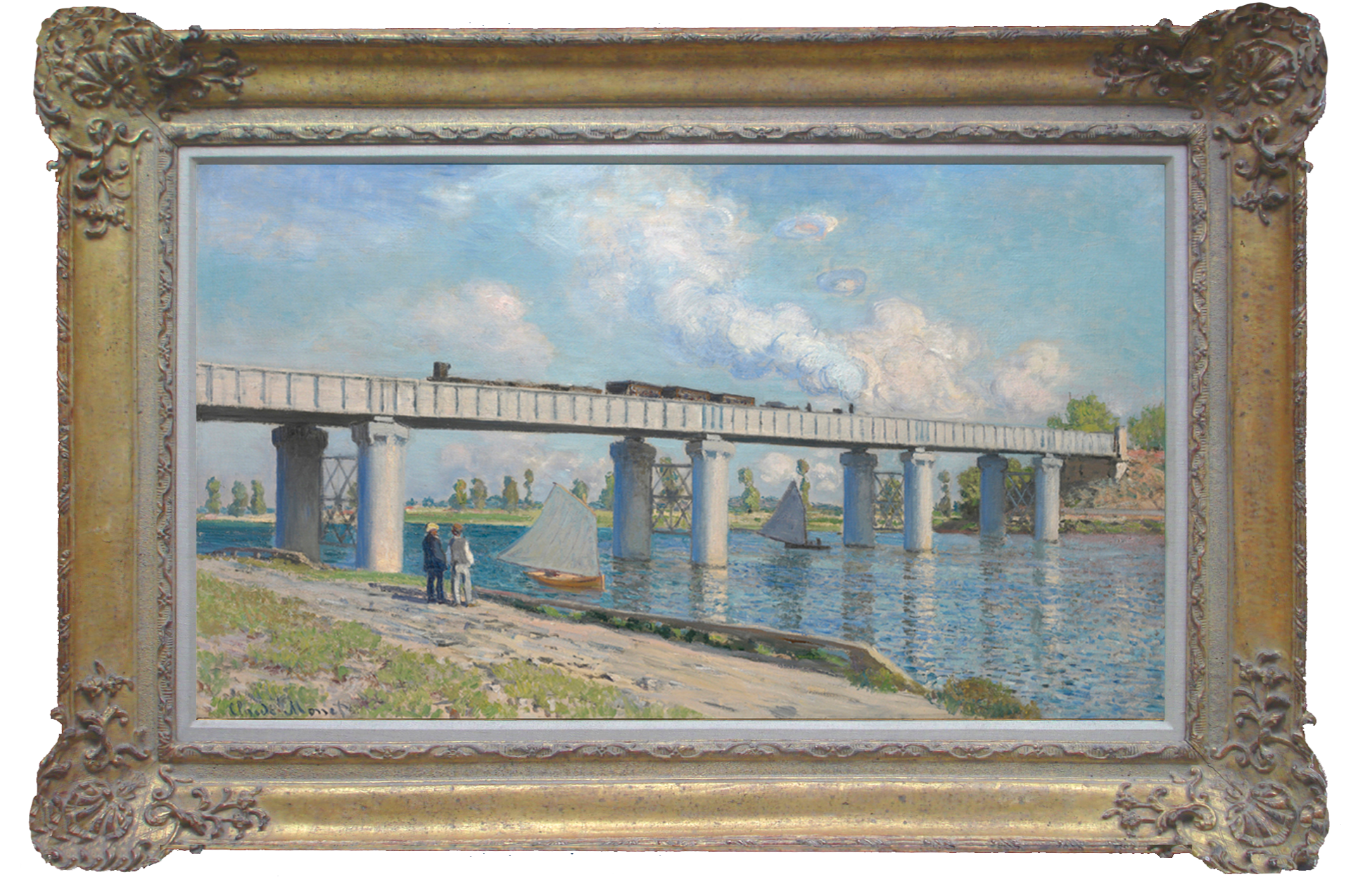
Before
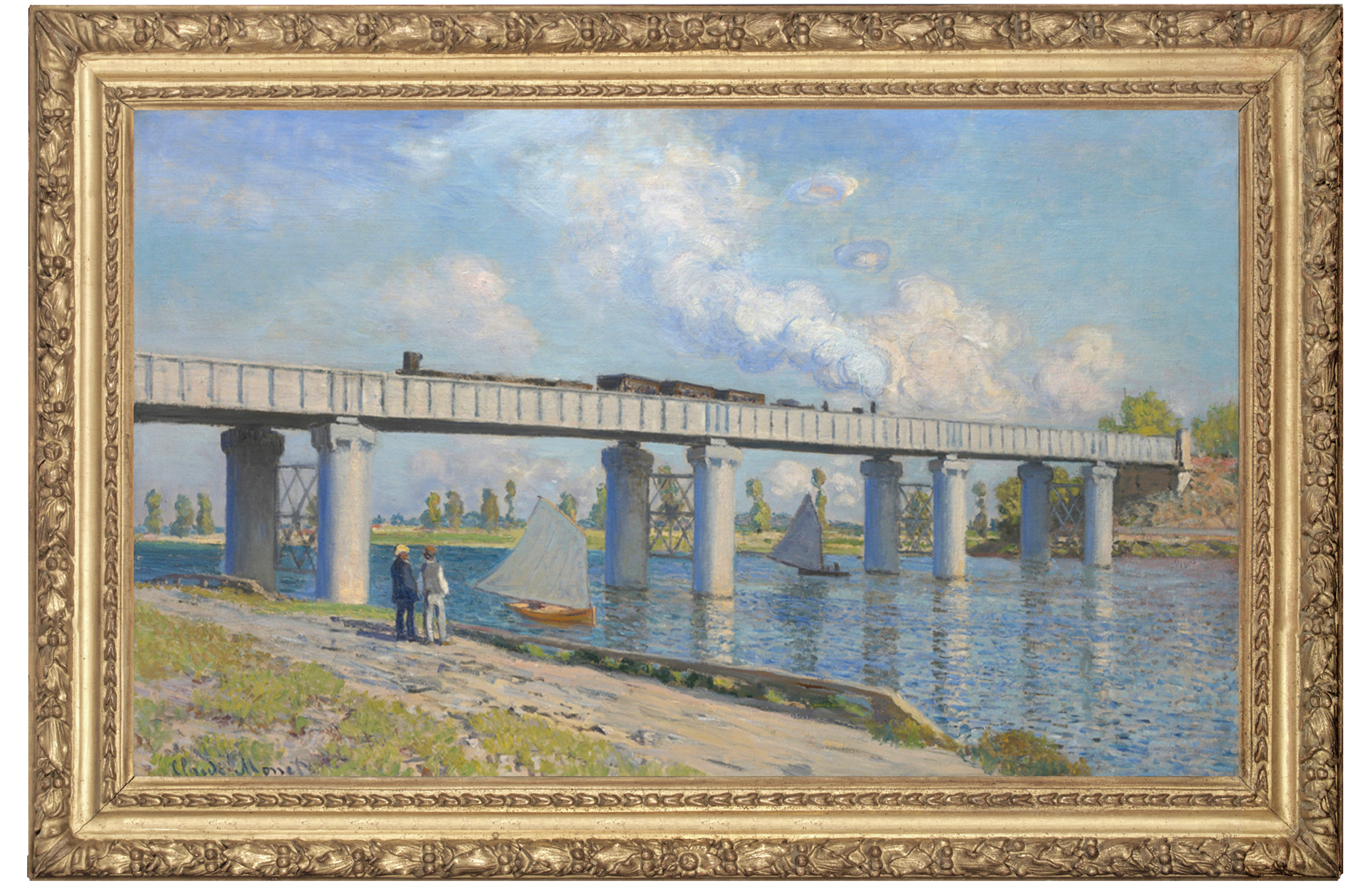
After
CLAUDE MONET (1840-1926)
Railway Bridge at Argenteuil, 1873
Private Collection Photo @ Christie's Images/Bridgeman Images
Monet’s radical image of the modern age blending with rural life on the Seine was undercut by the dull tone and distracting corners of its tea-traylike frame and intrusive white inlay. The finely-detailed antique Louis XIII frame echoes the style of those seen in photos of the artist’s studio, and the gilding emphasizes the brilliant clarity and colours in this avant-garde landscape.
Before
After
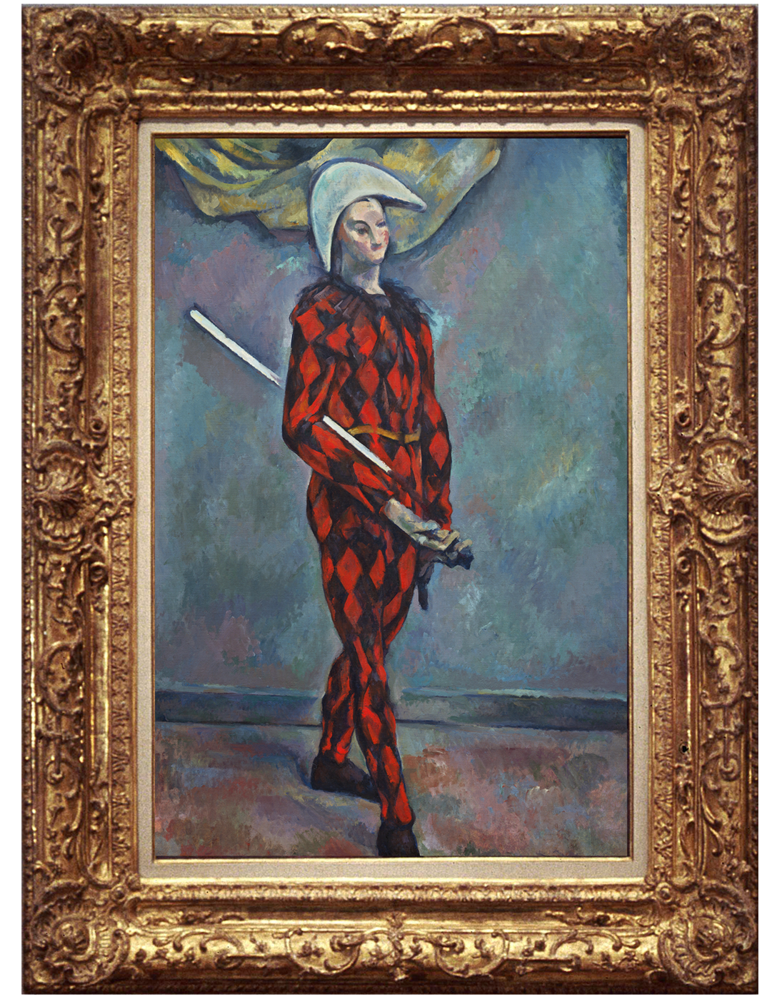
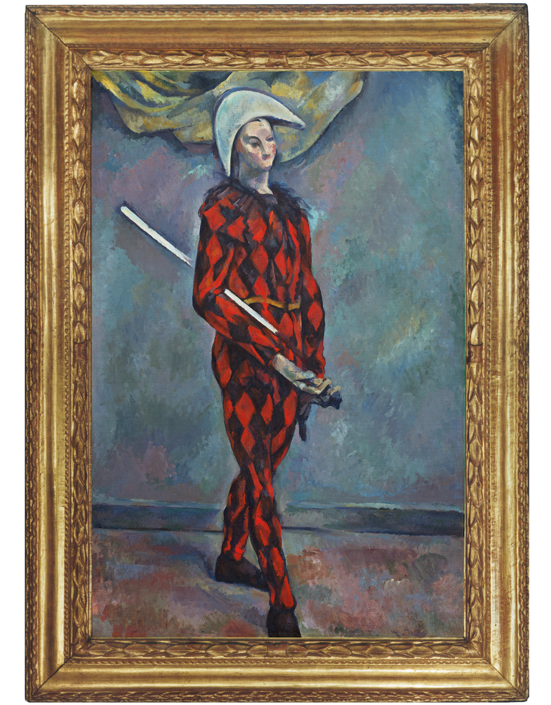
PAUL CEZANNE (1839-1906)
Harlequin, 1888-90
National Gallery of Art, Washington
Excessive ornament on the previous French Baroque style frame conflicts with the subject. By contrast the simpler leaves of this Italian 17th century frame echo Harlequin’s costume. The figure is further animated by the frame’s forward projecting profile and outer ribbon. A case of less is more.

Before

After
ÉDOUARD MANET (1832-1883)
The Ship's Deck, c.1860
National Gallery of Victoria, Melbourne
As with many of the Impressionist artworks, this painting was previously shackled in a highly decorative Louis XV style frame, originally designed for an 18th/19th century portrait where the scale of the sitter would be appropriate for the size of the corner and centre cartouches.
This 19th century neo-classical revival ’Salon’ frame (that Manet and his fellow Impressionists were also noted for using) both compliments and enhances the composition, with its concave profile that draws your eye into the perspective, whilst providing a classical setting.
Before
After
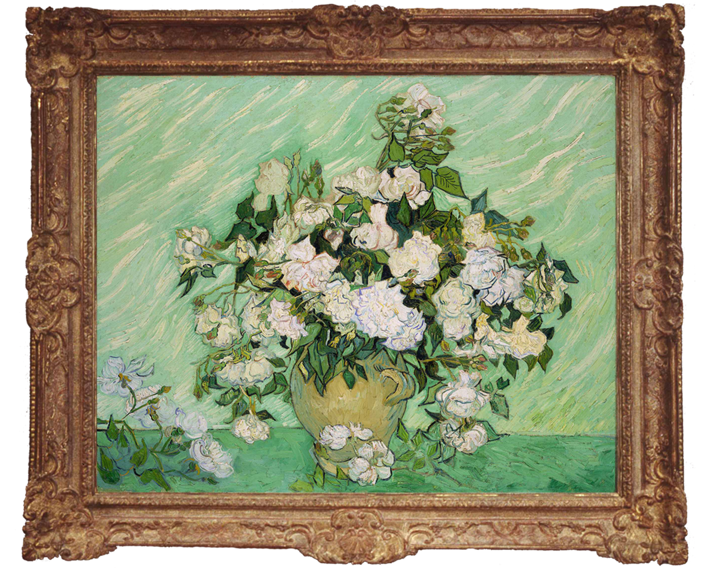
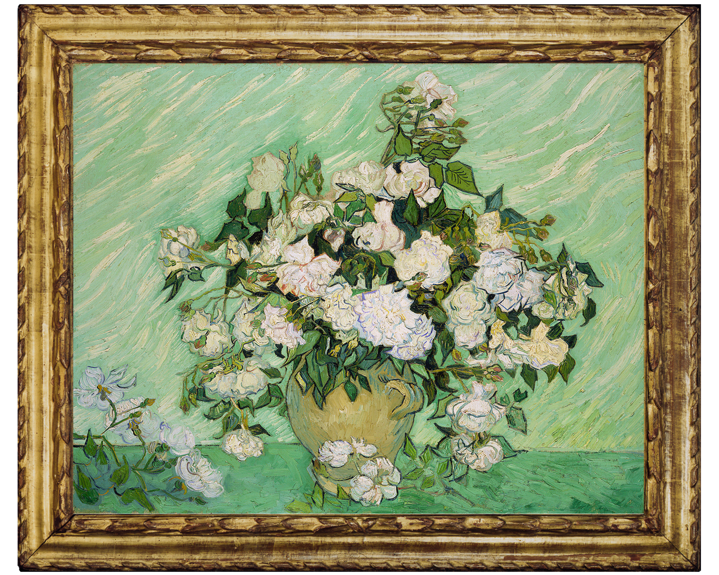
VINCENT VAN GOGH (1853-1890)
Roses, 1890
National Gallery of Art, Washington
The use of French Baroque portrait frames has long been a convenient formula for framing Impressionist and Post-Impressionist works. Degree of success depends on frame’s design, quality and finish. Here, the previous frame was a reproduction of unsympathetic colour whose projecting corners and centres competed with the pattern of roses. An Italian 17th century frame similar to the Cézanne was acquired whose continuous ornaments and original water gilding resonated with the composition and palette.

Before
After
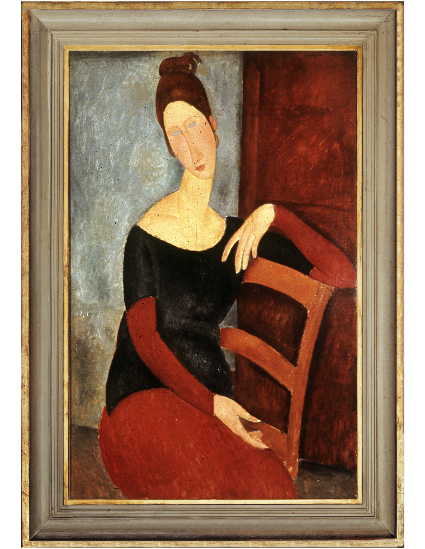
AMEDEO MODIGLIANI (1884-1920)
Portrait of the Artist's Wife, Jean Hebuterne, 1918
Norton Simon Museum
This elaborate French Rococo frame reflects the dominance of French taste in the early 20th century to the point of suffocation. The clean lines and grey-green hue of this contemporary Artist's frame ideally complement the minimalist contours of the sitter and planes of colour. Ornament is banished and equilibrium restored.
Before
After
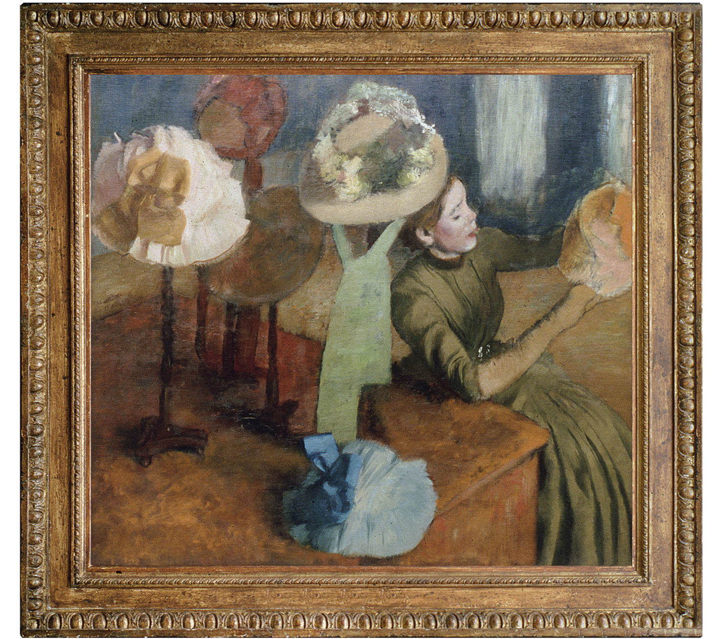
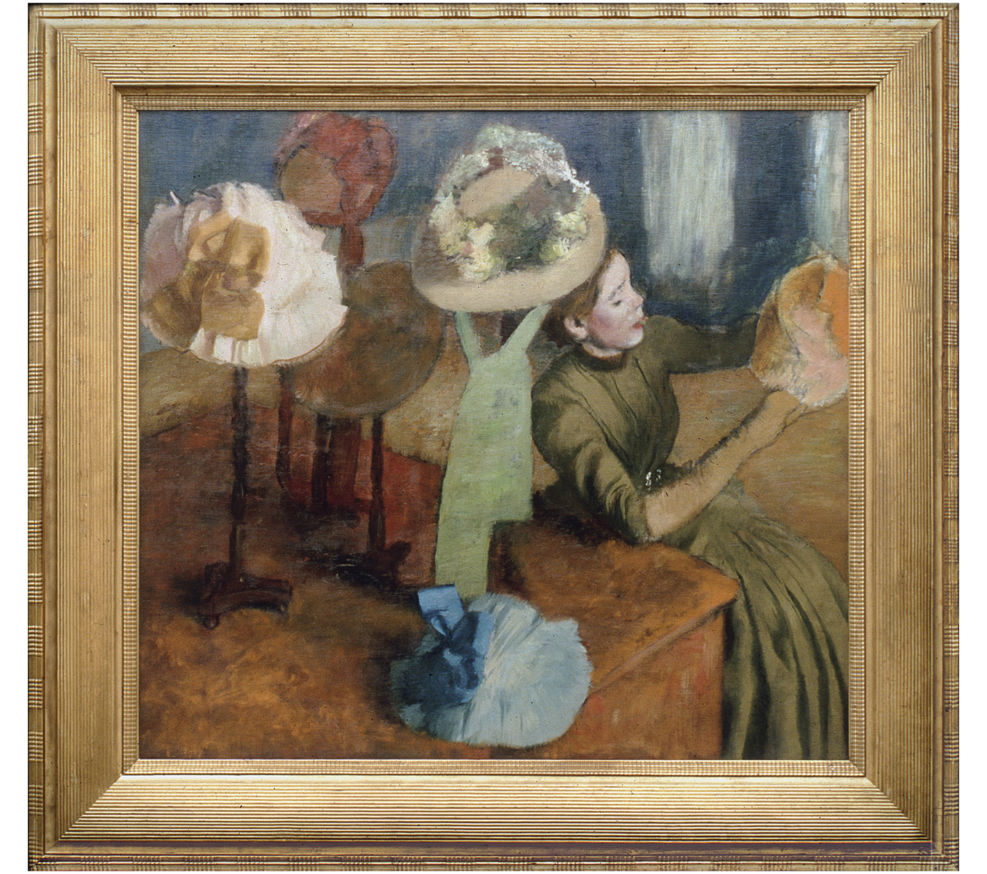
EDGAR DEGAS (1834-1917)
The Millinery Shop, 1879/86
Art Institute of Chicago
Degas was very particular about the framing of his works and designed several frame styles recorded in his notebooks. Previously in a reproduction pseudo-classical moulding frame, the presentation of this masterpiece was transformed by the acquisition of this rare 'Degas' style reeded frame with its vibrant original gilding.
Before
After
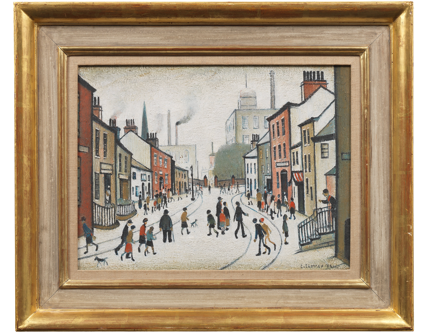
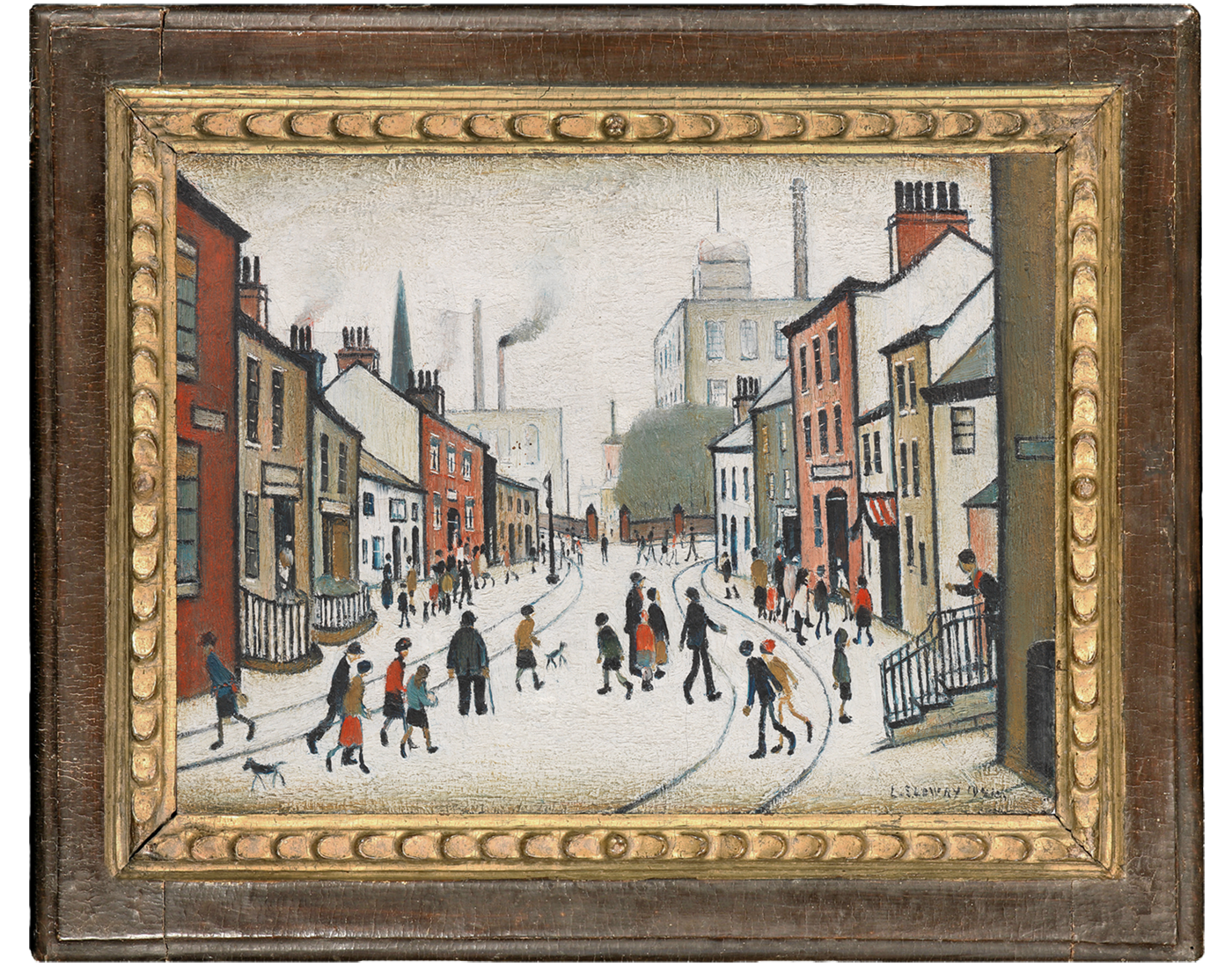
L. S. LOWRY (1887-1976)
Street Scene, 1941
Private Client (courtesy of Bonhams)
The composition of Lowry’s street scene is built on the strong perspectival thrust of the road itself, leading inwards; yet the width and proportions of the previous frame, increased by the intrusive canvas inlay, overpowered both this dynamic recession and the busy scurrying figures which animate it. The solution was an antique cassetta finished in a tactile crackled brown, with a sight edge of softly gilded leaves; this lights up the whole scene and echoes the rounded figures.
Before
After
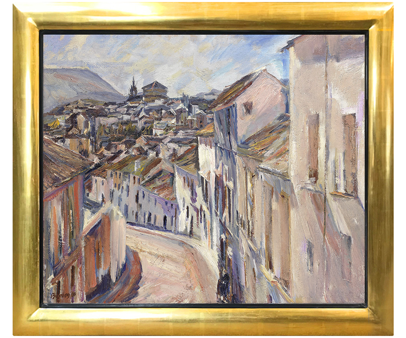
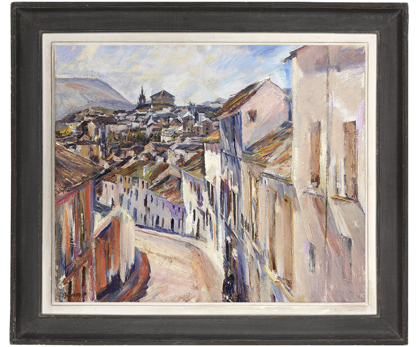
DAVID BOMBERG (1890-1957)
The Old City and Cathedral, Ronda
Private Client (courtesy of Bonhams, London)
Sometimes it seems as if the only framing solutions for a 20th-21st century painting were either a brilliant gold or a white convex moulding, whatever effect this had on the colours and tones of the painting itself. Bomberg’s tumble of sunlit buildings and roofs was saved from the blinding distraction of cheap gold by an early 20th century British artist’s frame, retaining the original finish of charcoal grey tempera and pale gesso. This soft monochrome duet opens the image up to the viewer, enhancing the colours and mirroring the contrasts of light and shade.
